Saturday, October 31, 2009

Jean Tschumi, Bernard Tschumi & DOCOMOMO

On Wednesday evening I attended a party at Vitra celebrating the publication of a long overdue monograph on architect Jean Tschumi, written by Jacques Gubler and published by Skira. Jean Tschumi: Architecture at Full Scale documents the brief career of the Swiss architect who eschewed his Beaux Arts training in favor of "the polemical field of modernity and its technological expression." In the US, the name Tschumi is more well known prefaced by Bernard, rather than Jean, who died in 1962 at the age of 57, when his son was only 18 years old. His early death may have cut his architectural career short, but the quality of the architecture that he produced is evidenced in the pages of this monograph and in the Archizoom exhibition last year, curated also by Gubler.

jtschumi1.jpg

I'm especially taken by the image on the party invitation of the Aula de Cèdres, a conference center and auditorium at HEP Lausanne:

jtschumi2.jpg

On Wednesday Gubler spoke of Tschumi's architecture relative to color (embraced by the architect, but rarely captured in documentation of buildings) and scale, referring to the book's subtitle and the architect's consideration of design from furniture to the city. The book offers an in-depth exploration of Tschumi's career, which includes a number of office headquarters, for Nestlé, La Mutuelle Vaudoise, and the World Health Organization. (This blog post at New Switzerland gives a decent overview of the qualities of Jean's architecture.)

One is tempted to break down how the father's architecture influenced Bernard Tschumi's, though if an influence on the latter is evident, it is in the year's since his father's passing. Some brief words on Wednesday by the architect of the new Acropolis Museum pointed to little discussion between the two regarding architecture. In fact Bernard admits that he didn't decide to pursue architecture until a trip to Chicago, only a few weeks before his father died. But with time to study his father's buildings, and a role in Architecture at Full Scale, it would be difficult not to find Jean's influence on his son.

tschumi-acropolis.jpg
[new Acropolis Museum | image source]

Looking at the two buildings shown above, I would say the influence of Jean on Bernard happens primarily with thinking about site. The above clearly illustrates how the new Acropolis Museum's top relates to the distant Parthenon, while the lower floor contends with the ruins preserved below. In between, the museum is all about movement and the clarity of the exhibition, but it can be seen as the byproduct of contending with the site below and distant. The elder Tschumi's HEP building skillfully addresses the site's topography (as can be seen here) and adjacent buildings, standing out formally but fitting into the multi-faceted landscape.

docomomo_us.jpg

In the Wednesday-night party's introduction by Nina Rappaport, Chair of DOCOMOMO-New York/Tristate, the preservation of Jean Tschumi's architecture in Switzerland was commended, an unspoken difference between an appreciation of Modernism's gems and the demolition of the same in part or in full an ocean away. The US chapter of DOCOMOMO (international working party for DOcumentation and COnservation of building sites and neighborhoods of the MOdern MOvement) includes ten regional chapters (all tolled the international DOCOMOMO is 53 chapters strong), but fights for preservation seem to be lost more often than won.

While this fact points to a limited appreciation in this country for architecture produced in the middle of last century, I can't help but wonder if this situation is more about ideology than taste. Modernism was predicated on progress and responses to the changes sweeping across the developed world from industrialization and world wars, so the preservation of the movement's buildings seems anithetical to their origin. That people equate modern architecture with the tabula rasa clearing of neighborhoods, towards the erection of towers in the park in that time does not help matters.

A couple issues further complicate matters: how many modern buildings were not built with the longevity of buildings centuries before; the open plans and platonic forms of modernism did not turn out to be as flexible as envisioned. These point to the necessity of preservation less than 75 years after many buildings of the era were completed and the creativity needed by architects to propose and carry out the adaptive reuse of modernist structures. I think the latter is key in efforts to preserve modern architecture, especially when faced with opponents arguing that demolition and new construction is cheaper and therefore better. The fact that many modern buildings are ingrained and important elements in their neighborhoods (ironically, like the older buildings many modern structures replaced) is perhaps the strongest argument for DOCOMOMO's continued relevance today.

Redesigning Kitchen with French Kitchen Design

French kitchen design masterKnowing French kitchen design


French kitchen design ideas 2009redesign your kitchen become French kitchen design


making French kitchen designelegant French Kitchen design 2009


best French kitchen design 2009
Redesigning Kitchen with French Kitchen Design


Redesigning Kitchen with French Kitchen Design

French kitchen design masterKnowing French kitchen design


French kitchen design ideas 2009redesign your kitchen become French kitchen design


making French kitchen designelegant French Kitchen design 2009


best French kitchen design 2009
Redesigning Kitchen with French Kitchen Design


Happy Halloween!

Hope you have a fun day full of lots of treats and no bad tricks!BOO!

New Local Worlds in Section

[Image: "Moravian Mount" from New Local Zlín by Margaret Bursa].

In a recent post I included an image from Margaret Bursa's project New Local NY, which she produced while a student at the Bartlett School of Architecture. Bursa's tutors for that project were Mark Smout and Laura Allen, of Smout Allen; and I should right away that I'm consistently amazed at the quality of work coming out of Smout Allen's studios.

I thought, then, that I should take the occasion to share more images from Bursa's projects. You can check out her website here.

[Images: From New Local NY by Margaret Bursa].

New Local NY features "a ‘landscape of movement’," Bursa writes. It "takes the form of a condensed urban playground on the west side of Manhattan, overhanging onto the River Hudson," and it was at least partially inspired "by the ongoing relocation of immigrants and cultures to America, in particular Sokol, a Czech mass-exercise movement, promoting togetherness, flocking, fresh air and cultural pride."

The result is an intensely colorful, wind-powered megastructure, sitting comfortably astride the worlds of home craft and experimental architecture.

[Image: From New Local NY by Margaret Bursa].

Here are some amazing sectional sketches:

[Images: From New Local NY by Margaret Bursa; larger version one and two].

Then there is New Local Zlín, an earlier companion piece to New Local NY.

Zlín, Bursa explains, is the fading capital of the Bata shoe-making empire:
    The Czech town of Zlín is the site of a social, industrial and architectural experiment begun by Tomas Bata in 1894. However, his shoe-making factories that were once the town’s driving force no longer operate and so the social and commercial structure of the town and its suburbs are in decline. Responding to the New Local Manifesto, a layer of facilities is laid over and interwoven into the residential neighborhoods where seven housing typologies are afforded dual functions of work and domestic life such the House of Drink, where both production and consumption are combined.
The images, again, are drenched in color and extraordinarily detailed.

[Images: "House of Drink," "Greenhouse," and town plan from New Local Zlín by Margaret Bursa].

The next project is a kind of tube-diorama: you look into the miniature landscape and see autumn trees, a ruined Greek temple, and a many-windowed architectural section standing in silhouette.

The project seems to come with the implication that, when you look inside a telescope, perhaps it's possible that you might simply be seeing a world inside the telescope—that is, an optical device that, instead of revealing new worlds from afar, actually contains local worlds within it.

[Image: From Layered Landscapes by Margaret Bursa].

Called Layered Landscapes, the project is a "compositional map," Bursa writes, and it comes complete with hardcover book and poster.

[Images: From Layered Landscapes by Margaret Bursa].

Finally, I have a weird affinity for sketches of archways, and so I'd be remiss if I didn't include this short series of brick studies—called, unsurprisingly, Brickscape.

[Images: From Brickscape by Margaret Bursa].

In any case, there's some great work in there. Check out Bursa's site for a bit more.

Interior Design Photos

http://freshome.com/wp-content/uploads/2008/11/white-blue-interior-design.jpg

http://homeinteriordesign.biz/wp-content/uploads/2009/07/SKB-Architecs-Luxurious-Modern-Interior-Home-Design-6.jpg

http://www.theestopinalgroup.com/lib/images/interior_design_113815.jpg

The image “http://www.fortedesigns.co.uk/images/montages/interior-design.jpg” cannot be displayed, because it contains errors.

http://freshome.com/wp-content/uploads/2009/01/interior-design-focal-point.jpg

Megan Fox Shops For Furniture In LA


The poor-mans Angelina Jolie, heart throb Megan Fox was shopping for furniture recently. First at Indigos (pictured here) and next to high-end Cisco Brothers in LA. I thought the story of the founder was inspiring.
Cisco Pinedo has become well known in the furniture industry as a leading designer of high quality upholstered furniture and unique casegoods.This is the story behind the man and his company, Cisco Brothers Corporation.

Born in a small rural town in Jalisco, Mexico, his family decided to leave the country in search of a better life. In the mid-seventies, Cisco found himself in South Central Los Angeles with the challenge of learning a new language and trying to fit in a new culture. He was only 13 years old.

In high school, Cisco discovered his passion for upholstery while working part-time in a small shop in Huntington Park. His job was to disassemble sofas, but Cisco quickly became fascinated by how each piece was put together.

His drive for knowledge helped Cisco find a job for an upholstery manufacturer. With his typical hard work and perseverance he soon learned how to run a business first hand. In his early twenties, he began making custom furniture for neighbors out of his garage in his South Central home. As his small enterprise began to grow, he and his wife, Alba recruited the help of their family members to help him run their thriving business. Cisco Brothers Corporation was born.

In a highly competitive, design-driven industry, Cisco Pinedo developed his furniture with superior craftsmanship, cutting-edge style, and unparalleled value. The closely-knit family atmosphere of the company nurtured uncommon client loyalty. After the 1992 Los Angeles riots, Cisco decided to remain in the heart of South Central. It was a risky business decision, but Cisco saw the need to revitalize his ailing childhood neighborhood. The move proved to be timely as the company continued to expand.

The success of Cisco Brothers has been a critical component in the redevelopment of the entire area surrounding the business while at the same time providing training programs and secure employment for many families in the vicinity. In 2006, Cisco developed the Inside Green™ method of construction and became the first designer to create 100% FSC Pure sustainable upholstered furniture. The company moved exclusively to FSC Pure certified woods on upholstered furniture, using reclaimed hardwoods for a collection of stunning case goods and the use of water based glues and environmentally friendly detergents to wash all fabrics.

Today, Cisco Home has six retail showrooms including a gallery at ABC Home Furnishings in NYC and the acclaimed LA Design Center in South Central Los Angeles.

Bev & Mike
Landfair Furniture + Design Gallery
Become a fan on Facebook

Home Decoration

The image “http://freshome.com/wp-content/uploads/2009/01/modern-living-room2.jpg” cannot be displayed, because it contains errors.

The image “http://freshome.com/wp-content/uploads/2009/01/modern-living-room1.jpg” cannot be displayed, because it contains errors.

The image “http://www.mwinteriordesign.co.uk/images/interior_design_southwales/interior_design_wales.jpg” cannot be displayed, because it contains errors.

The image “http://img.alibaba.com/photo/11095390/Sell_Luxury_House_Interior_Design.jpg” cannot be displayed, because it contains errors.

http://www.ruddats.com/images/interior-design-newyork.png

Interior Design Ideas

If you like the idea of coming up with your own home Interior design,you are not alone. Lots of folks these days are planning out and then executing their own interior designs. But how do you come up with great home interior design ideas? Here are a few suggestions to get you started.

The image “http://freshome.com/wp-content/uploads/2009/01/modern-living-room6.jpg” cannot be displayed, because it contains errors.

Probably one of the easiest ways to get home decoration ideas is to simply watch television these days. There are several shows that are dedicated to the subject of completely redesigning an entire house room by room. The biggest problem with watching these television shows is having something in front of you as documentation. So a couple of ideas that may help out is to have a pencil and paper available to take notes as you go, and also to record the program for viewing later on.

Even though you may get some great home interior design ideas from these television shows, ask yourself whether or not they will fit well in your particular home. Just because they look great on television in someone else's home does not mean that it will fit in well in your home. So try to visualize the whole project from beginning to end in your house. And plan, plan, plan. By taking extra precaution in the planning stages, you can ensure a more problem free application.

The image “http://freshome.com/wp-content/uploads/2009/01/modern-living-room5.jpg” cannot be displayed, because it contains errors.

The image “http://freshome.com/wp-content/uploads/2009/01/modern-living-room4.jpg” cannot be displayed, because it contains errors.

However, television is not the only source for home decoration information and ideas on Interior design. There are several great books on the subject that are able to help designers of almost any background and experience level. The advantage of books is that the documentation is already done for you. It usually has a very well thought out plan for implementing any kind of home interior design on its pages. And usually you'll be able to have more than enough photos and pictures to help get a good mental picture of the process as it goes.

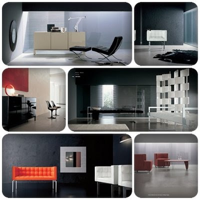
Another way to get excellent ideas for interior design is to look through magazines on the subject. There is no shortage of magazines that are devoted to home decoration and interior design. Believe it or not, even many professional interior designers collect large quantities of magazine articles and pictures and store them in a way that will help them have a larger pool of ideas to draw from in the future. Not being a professional yourself, it may be a good idea to start your own scrapbook of home interior design articles and photos that you can separate according to a specific theme or room type. Sometimes, the best decoration ideas are a combination of things that are brought together from several different sources to form a unique, one-of-a-kind design.

Interior Design

Spacious rooms
If you love the wide open spaces and want the light and airy atmosphere, here are some tips on achieving that sense of spaciousness in your rooms.

- To create a feeling of largeness in your room, eliminate the shadows that tend to slice a room up into smaller spaces. Work on lighting the room with a soft, even light. Avoid ceiling lights as they tend to make the ceiling feel lower. Diffused, ambient lighting will tend to enlarge the room.

* Keep the surfaces free of heavy textures. Smoother surfaces tend to reflect more light and make the room feel larger.
* Avoid heavy textured flooring. Choose tile over patterned or textured carpeting. Reflective and shiny surfaces such as mirror and chrome also can be used effectively.
* Soft colors and monochromatic color schemes. Use cream, beige, gray or cool pastels on your walls and floors to make them recede. The ceiling should always be the lightest color in the room.
* Limit the use of patterns in the room to create a more airy feeling. A typical application of a pattern might be to reserve it for an accent piece.
* Selection and placement of furniture in a room is crucial in defining the space. Keep the largest pieces against the walls whenever possible.
* Choose furniture colors that are the same or similar to those selected for the walls and floors.

Cozy rooms
If you want a cozy and comforted ambience, here are some points to consider a more intimate space.

* Create spaces through the use of directed light. Lighting from the ceiling will seem to lower it. A reading lamp or down-shaded lamp will cast light only in its relative vicinity. Use incandescent rather than halogen or florescent lamps for a warmer glow.
* Choose strong colors for your walls and floor. They will tend to bring them in closer towards one another.
* A dark floor with walls of brown or deep red, blue or green tones will help create the feeling of a smaller, cozier space.
* Heavy, soft textures add warmth to a space. Use rougher textures for the hard elements in the room; iron instead of chrome, brick instead of glazed tiles.
* The use of pattern in a room can also lend a sense of coziness to the space. The subject of mixing patterns in a room will be covered at some future time.
* Choose dark finishes and fabrics to create a sense of the piece being larger than it actually is. Heavy textured fabrics and large patterns will add a cozy feeling to a sofa or chair.
* Place pieces away from the wall and use tall pieces to divide and define smaller spaces within a room for greater intimacy.

https://blogger.googleusercontent.com/img/b/R29vZ2xl/AVvXsEiZ3S80VzX6dPFqsUudcq3BS18JCQA2b6qXV1vB085Ff4AEQbjHddaaMVYFjOOAwa7XfgUPWnx2gDC2ooCPa1wB0RLUs0XOai9yAXyllYQgLRavdE8Y5IioFYwm2c3aN0ZYf2wHdP1g5YeD/s400/Interior+Design+Ideas.jpg

Room corners
The corners of our rooms can be decorating assets or just a boring space. With a little imagination you can make the corner space work for you and create a beautiful area in your room.

* The void corner of the room can be fill with natural or artificial tree.
* An uplight addition will give a beautiful look.
* Pedestals of varied sizes look good in corners.
* A table top with a beautiful fabric and a couple of chairs to each side with coordinating fabric on the seats can give a very dramatic look. Add a lamp, your favorite pictures and collectibles for a gorgeous tablescape.
* A corner cabinet or hanging cupboard is a handsome solution and adds needed storage and display areas as well.

The image “http://img142.imageshack.us/img142/7615/vbrchildrensroomqg1.jpg” cannot be displayed, because it contains errors.

Storages
One of the most important basics in decorating a small space is to purchase furniture that does double or triple duty for storage. Purchasing multiple purpose accessories and furniture allow options that give your living space character and flexibility.

* Sofa cum bed : A sofa for your living room area might contain a bed for yourself or unexpected visitors.
* Tables containing drawers or shelves give you other options further storage.
* Bookshelves with or without doors, can be appropriate for entertainment centers, home offices, kitchen storage or bedroom storage.
* Bathroom storage units are great for under sink storage. These units increase your storage capacity in a small area.