


And don't forget to listen to the entire conversation here.

 Subscribe to ::Surroundings:: Subscribe to ::Surroundings::
 Every so often a singular room launches a color craze. You might think of it as the "tipping point room" - that one additional photo that makes you think, "I've got to have this color in my house!" In my opinion, Anna Beth Chao's bedroom, recently featured in All the Best's bedroom contest, is that tipping point room. Painted in Farrow & Ball's Down Pipe (26), it is modern, stately, chic and cozy all at once. I could be wrong, but I think the success of Anna Beth's room may inspire alot of people to try this gorgeous deep blue gray in their own homes. **Update - Anna Beth has a blog - www.hashai.com **Design by Anna Beth Chao, Reader's Choice Award and Honorable Mention - All the Best Bedroom Contest
  Farrow & Ball's Down Pipe is used on the ceiling of this formal dining room with it's very hip gold chandelier. Designer Jessica Lagrange Interiors, image from Chicago Home, Sep - Oct 2009
 Anna Beth said her choice of Down Pipe was inspired by the designs of Abigail Ahern. Here are two rooms from Ahern's own apartment.
 A room featured in Ahern's book, A Girls Guide to Decorating, graces the November 2009 cover of Living etc.
 I'm not sure if the wall in this interior by John Jacob Zwiegelaor is Down Pipe, but it's fairly close.
.jpg) Back in the beginning of September, I painted the fake 50's stone hearth and surround of my fireplace with Down Pipe after I changed the wall color from a green yellow to a light blue gray.
Back in the beginning of September, I painted the fake 50's stone hearth and surround of my fireplace with Down Pipe after I changed the wall color from a green yellow to a light blue gray. At the time I was feeling quite pleased with myself because I only spent $14 to finish the project, $7 for each sample pot. But now it's all gone and I'm sitting around here conjuring up what other surfaces in my house I can paint Down Pipe!
 This is my first time participating in Tablescape Thursday and I was inspired by my recent purchase of these two vintage tablecloths while on the Eddie Ross flea market tour. However, both were rectangular and neither one was the right size for my round table. Problem solved when they are layered, one crossing over the over and each one making up for the "short side" of the other. Yeah!
 The top tablecloth is the Fantasia pattern from the 70's. To tie in with the gray in the pattern, I was able to use the light gray napkins my late elderly neighbor, Mrs. L, gave me. This table is set for three - I only wish I could run next door to invite Mr. and Mrs. L over for lunch. At first I tried a floral centerpiece, but instead settled on pears in a vintage aluminum footed bowl.
 The glassware is from my Mom - purchase in Bermuda in 1961.
 Here are the lovely Creative Candles that were a gift from Eddie and Jaithan. Two sets of matching candlesticks create four different heights with these 12" and 18" tapers. They're Paris Gray and are more gray than they appear in this photo.
 Love small bouquets - this one is made from last Friday's white flowers w/cuttings from a butterfly bush and a shrub.
 After setting this table and lighting the candles, I thought to myself, "I should do this more often!" For links to more tablescapes, be sure to head over to Between Naps on the Porch for the 57th Tablescape Thursday!
 The following is an article I was interviewed for in this month's issue of Sherwin-Williams Stir
You can successfully incorporate orange walls in your design by choosing the right rooms, complementary colors and accessories.
Orange is a vibrant, happy, social color. An orange wall can bring a dynamic energy to any room. It can simultaneously brighten a space while warming it up. Paired with the right colors and accessories, a large swath of orange can make a room really shine. But orange walls haven’t always been an easy sell to homeowners.
An orange wall need not look like a giant homage to the citrus fruit; many different hues of this inviting, invigorating color exist in the paint world. Patricia Gray of Patricia Gray Interior Design in Vancouver, British Columbia, has selected three Sherwin-Williams paint colors that she feels illustrate the diversity of orange:
Like any dramatic color used abundantly, orange needs its counterparts.
"White or cream help balance the heat of the color," Gray says.
"Chocolate browns and charcoal grays are also accents that balance and coordinate nicely."
An example of what Sherwin-Williams Husky Orange might look like on a wall in a living room or family room.
Photo Jeffery Bilhuber
An example of what Sherwin-Williams Tango Orange might look like on a wall in a dining room. in a dining room.
Photo Antonia Hutt
An example of what Sherwin-Williams Kumquat Orange might look like
in a kitchen on a backsplash of back painted glass. The glass gives this color more vibrancy.
Photo Jennifer Gilmer
** Colors may show differently on computer monitors than in real life.
I always recommend painting a sample test.
Have you used orange paint in your home?
Do you think that you are likely to use orange in your home in the near future?
If so please let me know about it by leaving a comment.
Read full article at Sherwin-Williams Stir
Read another article on The Color Orange where I give examples of Benjamin Moore Colors.
Patricia Gray writes about 'WHAT'S HOT 'in the world of Interior Design, new and emerging trends, modern design,
architecture, and travel, as well as how your surroundings can influence the world around you.
© Patricia Gray Interior Design Blog, 2009
Hover mouse over picture to see title.
Click on picture to go to post.
Patricia Gray writes about 'WHAT'S HOT 'in the world of Interior Design, new and emerging trends, modern design,
architecture, and travel, as well as how your surroundings can influence the world around you.
© Patricia Gray Interior Design Blog, 2009

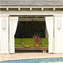
Turquoise Aquamarine
These are some of my favourite pictures I have been collecting
throughout the year of this beautiful color: Turquoise Aquamarine
Enjoy and have a wonderful Easter!


The color family of Turquoise and Aquamarine has more to do with feeling and creative expression than with rational thought. These colors between green and blue the shades of turquoise, blue green and aquamarine relate to transformation, evolution, change.
Aquamarine: stimulates the intellect and stabilizes the emotions, improves confidence, and the ability to stand fast, helps communication.
Turquoise: supportive and protective, heals the spirit, soothing, increases contentment.
Patricia Gray writes about 'WHAT'S HOT 'in the world of Interior Design, new and emerging trends, modern design,
architecture, and travel, as well as how your surroundings can influence the world around you.
© 2007-2009 Patricia Gray Interior Design Blog


